Grid Chart
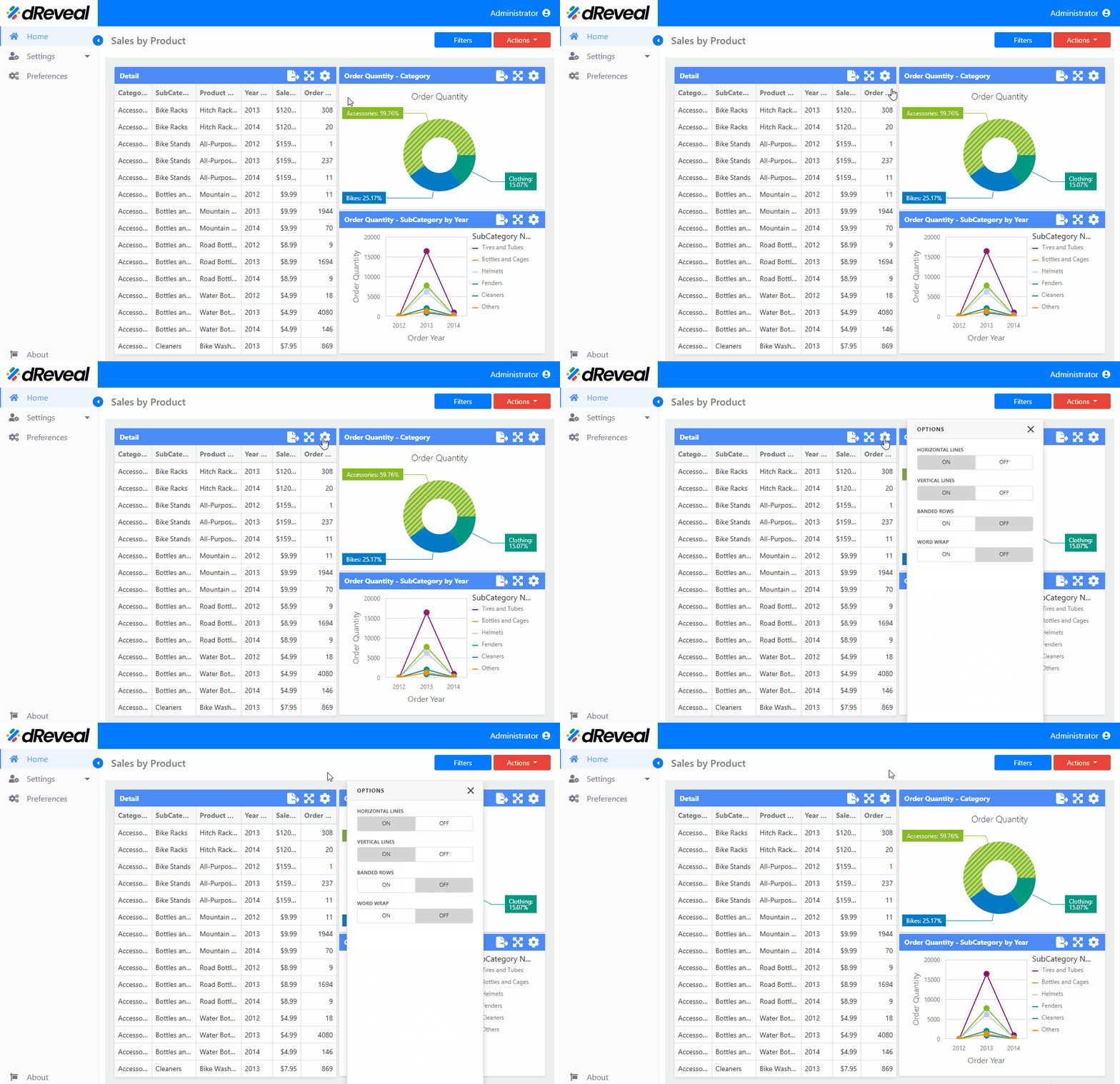
A Grid chart is a type of visualization that organizes data in a table, typically with rows and columns. It is often used to display large volumes of data in an organized and accessible way, allowing users to view and analyze the values of different variables or categories in a structured layout. Although it is not as "visual" as bar or line charts, the Grid chart is very useful for efficiently comparing data when dealing with numerical or categorical values. Various configurations of the Grid chart can be customized to improve its appearance and functionality. These configurations can be found in the Menu option. The following sections will detail these options:
| Options | Values | Description |
|---|---|---|
| HORIZONTAL LINES | ON/OFF | The option allows the user to enable or disable the visibility of horizontal lines on the grid. |
| VERTICAL LINES | ON/OFF | The option allows the user to enable or disable the visibility of vertical lines on the grid. |
| BANDED ROWS | ON/OFF | This option allows the user to apply or not apply distinct background colors to alternating rows. |
| WORD WRAP | ON/OFF | This option allows the user to display the content on multiple lines when the size of a dashboard item is too small to show the entire content on a single line. |
How to Apply the Settings of the 'Menu' Option
To apply the settings in a chart, first enter your username and password, then click the Login button. Once logged in, navigate to the report you want to run and double-click it to open. Next, click the Apply button to display the report. Once the report is loaded, click on the Menu option located at the top right of the chart; the icon is a gear. The available options for configuring the chart will then be displayed.
Grid Chart

